Thank you so much for viewing my blog once again. I am so happy to be building out this website for you, and I hope that the content on here is enough for you to transition careers from the Sex Work Industry to a safer, healthier lifestyle.
This blog post will be shorter. I will briefly discuss how to code a correlation plot so that you can determine which variables are correlated with each other. This plot is especially useful if you are attempting to run a Regression algorithm on your data set.
If your manager or supervisor is requiring you to run a Regression algorithm on your data, then there are some key questions that you need to answer:
1. Is there a relationship between your response variable (your dependent variable) and any of the predictor variables in your data set? If the answer is “yes” we can ask and answer the next question.
2. If there is a relationship between your response and your predictor(s), how strong is it? And finally:
3. Is the relationship linear?
How can we determine if there is a relationship, or correlation, between a response and predictors? This brings me to one of my favorite functions. Before I show it to you, let me load my library, set my directory, and load the bikes data set. As always, the code that you will type into R Studio is highlighted in BLUE and is BOLD:
library(tidyverse)
## -- Attaching packages ---------------------------------------
tidyverse 1.3.1 --
## v ggplot2 3.3.5
v purrr 0.3.4
## v tibble
3.1.4 v dplyr 1.0.7
## v tidyr
1.1.3 v stringr 1.4.0
## v readr
2.0.1 v forcats 0.5.1
## Warning: package 'stringr' was built under R
version 4.1.2
## -- Conflicts
------------------------------------------ tidyverse_conflicts() --
## x dplyr::filter() masks stats::filter()
## x dplyr::lag()
masks stats::lag()
setwd("C:/Users/firstnamelastinitial/Documents/R")
bikes <- read.csv("bikes.csv", header = TRUE)
The package that we need is the corrplot package. Here
it is:
library(corrplot)
## Warning: package 'corrplot' was built under R
version 4.1.2
## corrplot 0.92 loaded
I am going to remove the “date” column from our
analysis for a moment to show you the steps to using this package (this plot
doesn’t work well with dates). We do this by creating a new object, that stores
the numeric values of the data set, and selects the column that we don’t need,
which is “date.” The code will look like this:
bikenumeric <- bikes %>%
select(-date)
Next, we create another object in which the cor()
function is utilized. Our object, bikenumeric will be the argument that we pass
through this function:
bike_correlations <- cor(bikenumeric)
HERE WE GOOOOOOO! Now we can use the corrplot()
function. I am going to show you what it looks like, give you an additional tweak to make it easier to read, and then I am going to summarize why it is so
useful. Here is the corrplot() function:
corrplot(bike_correlations)
As you can see, the table is symmetrical. So, let’s make
it easier to interpret:
corrplot(bike_correlations,
type = "upper")
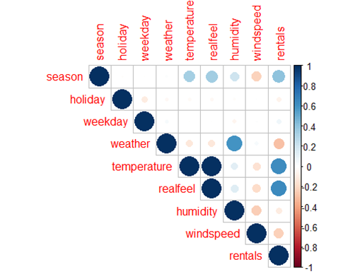
There we go. Let’s interpret it now! The color scale on the right, ranging from 1 (Dark Blue) to -1 (Dark Red), gives us the strength of the relationship and tells us whether or it is positive (+1) or negative (-1).
Let me
pick “realfeel” along the diagonal, follow east until there is a blue circle
and trace upwards to “rentals.” We can determine that these two variables have
a positive moderate linear relationship. In other words, as this relationship
is moderate, it might be worth while to use these two variables in a regression
equation.
This plot gives us a pretty good idea of which variables
are correlated to each other. If we wanted to use “rentals” as our response
variable, we might choose all the variables with moderate linear relationships
or higher (larger circles with darker shades, red or blue).
If this plot isn’t conclusive enough to determine which
variables are correlated to a response variable, we can add numbers to the plot that can give
us a more determinable interpretation. The code for that plot looks like this.
corrplot.mixed(bike_correlations)
According to the plot, “realfeel” and “temperature” both have a moderate positive correlation with “rentals.” Therefore, we could consider these two variables if we ever intended to fit a regression over “rentals.”
The colored decimals can be related to the color scaled on the right
side of the plot. The closer the number is to 1, the stronger the positive
relationship. The closer the number is to -1, the stronger the negative
relationship.
If you ever encounter a situation in which you needed to
determine the correlation between multiple variables in a data set, I recommend
the corrplot package. It isn’t perfect, but it is a simple way to explore the
correlations within your data, and thus, can help you make a decision of which
variables to use in a regression equation.
THANK YOU!
I hope that this shorter post was helpful. I am going to try to add more of these types of posts so that you can understand the functional aspects of R Studio and some of the machine learning algorithms that we will use for data analytics.
Thank you so much for your attention, time, and dedication.


